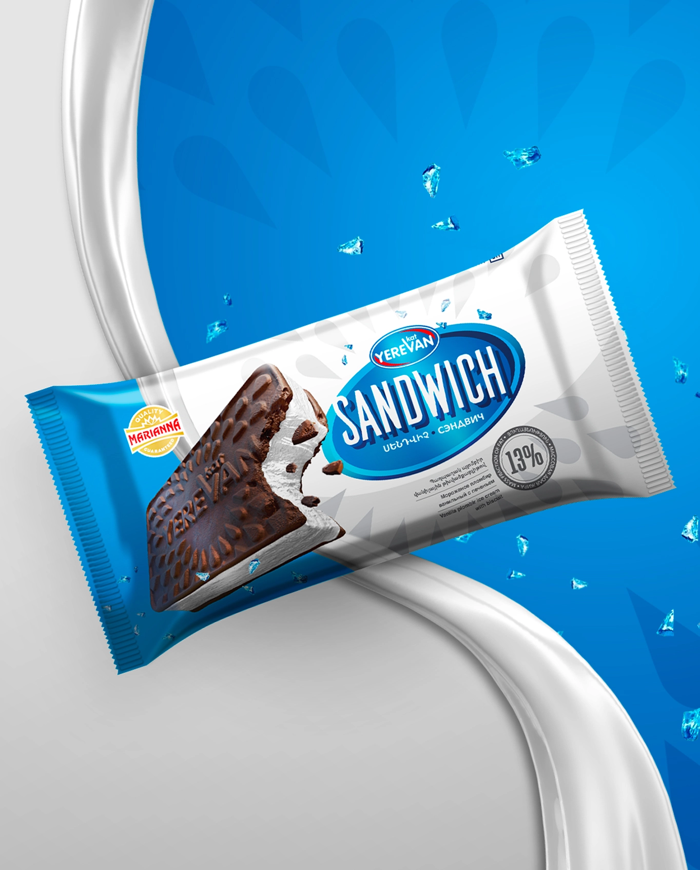
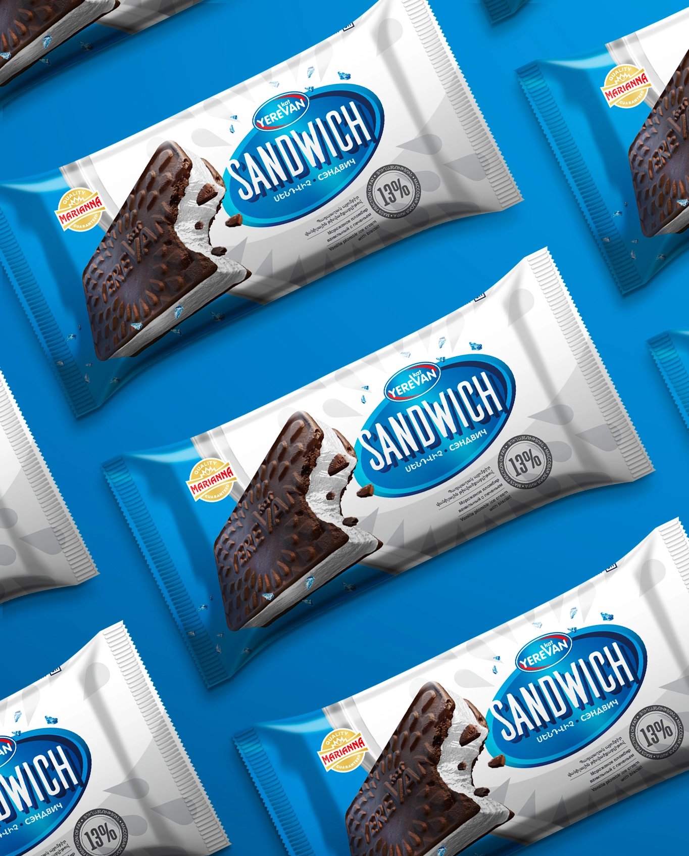
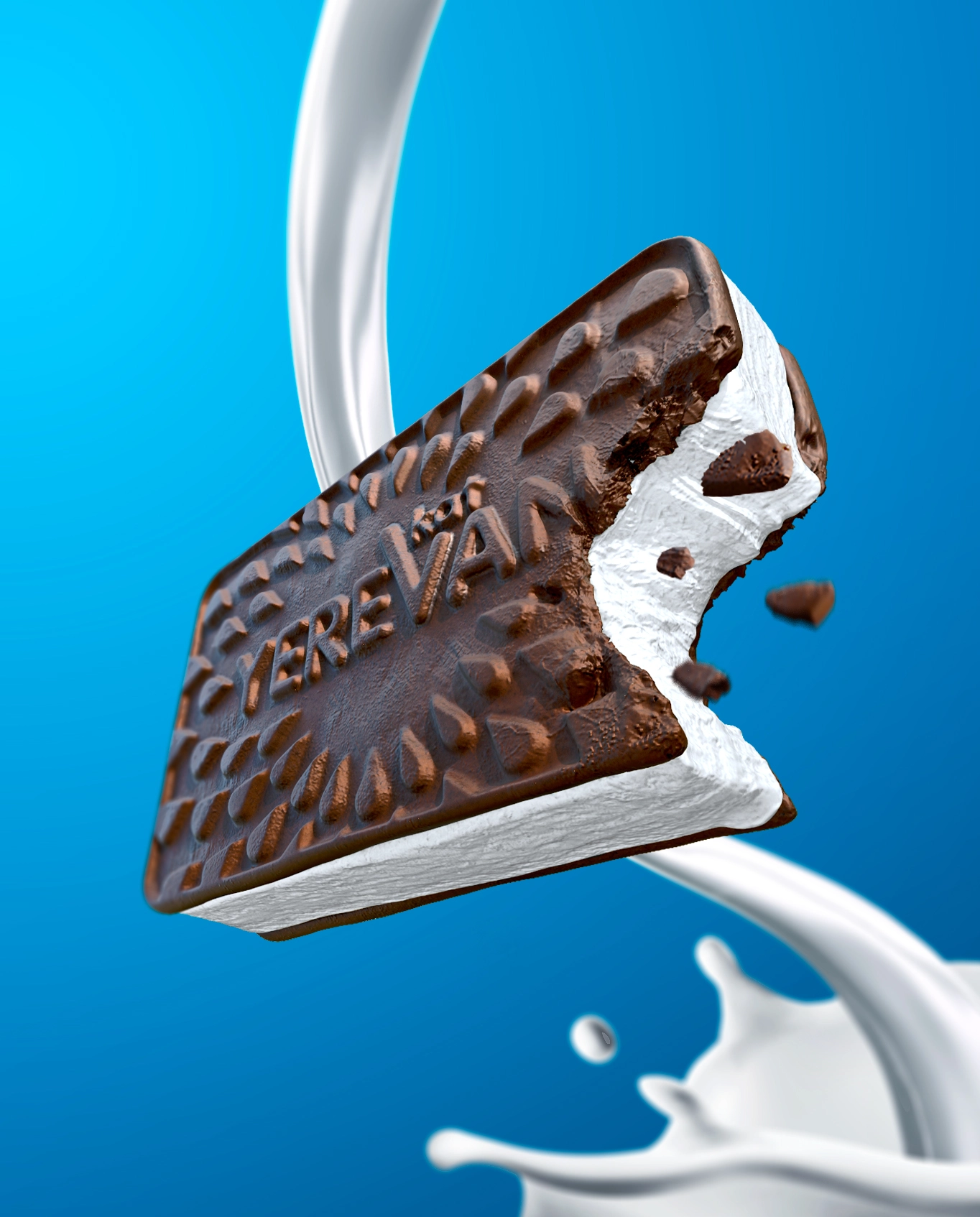
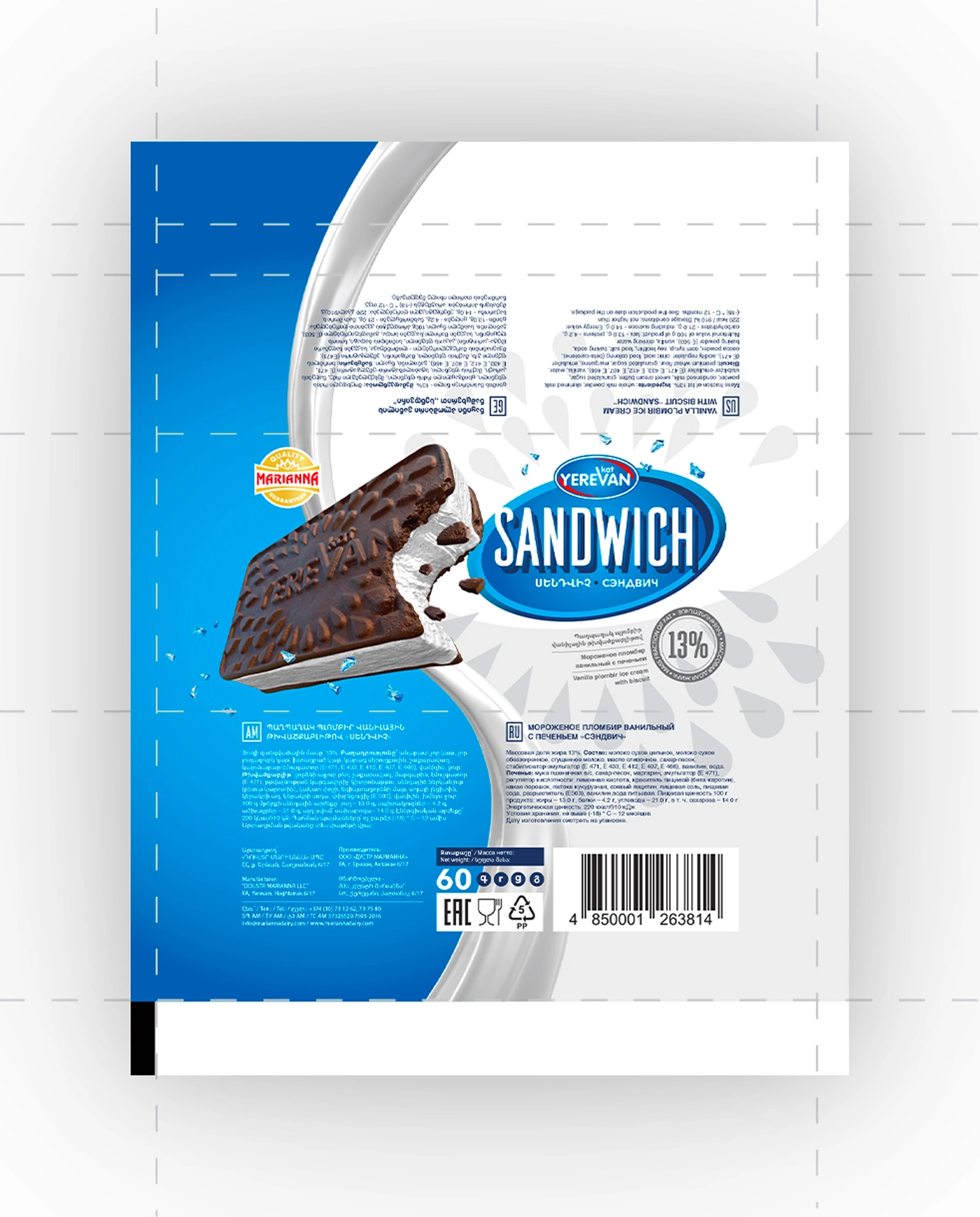
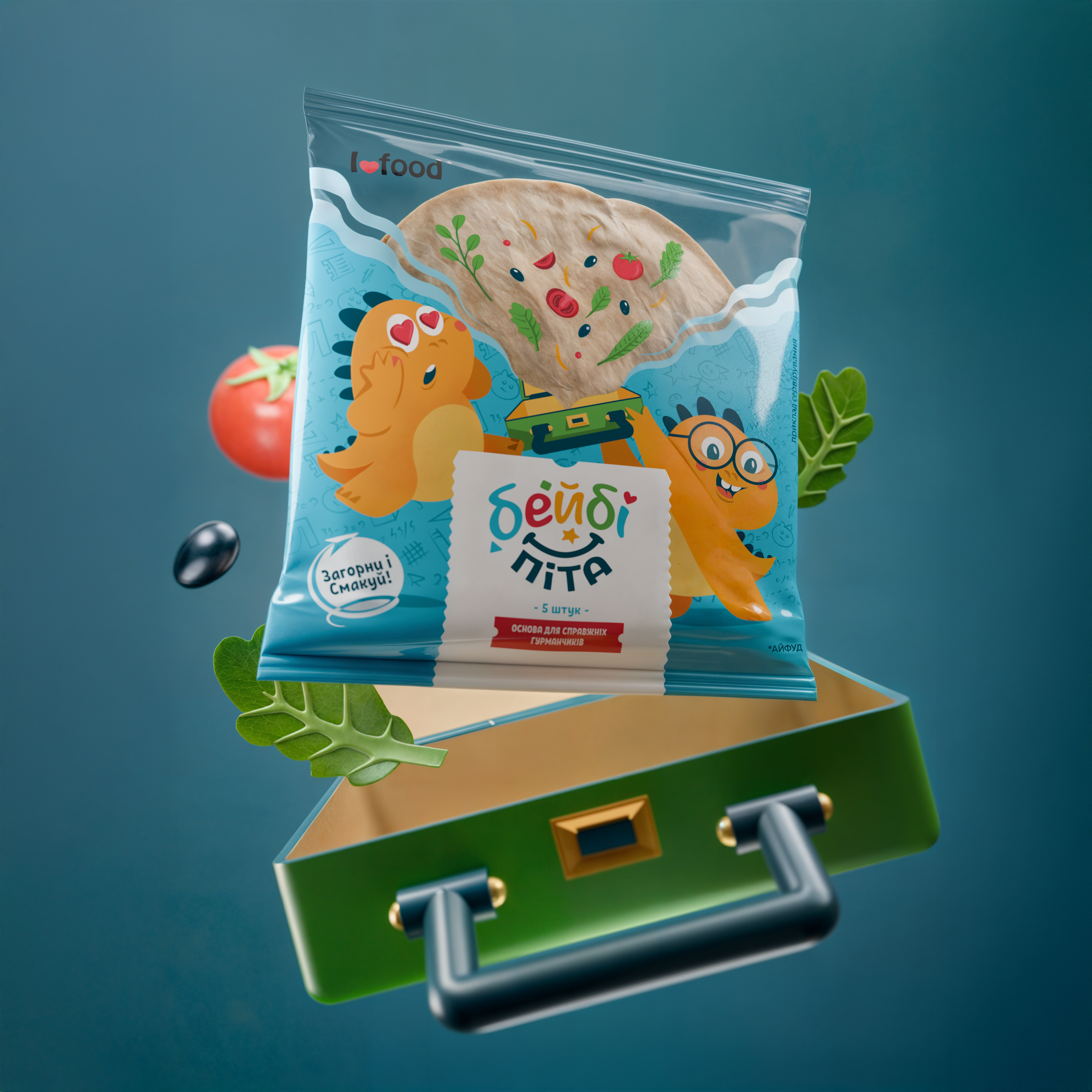
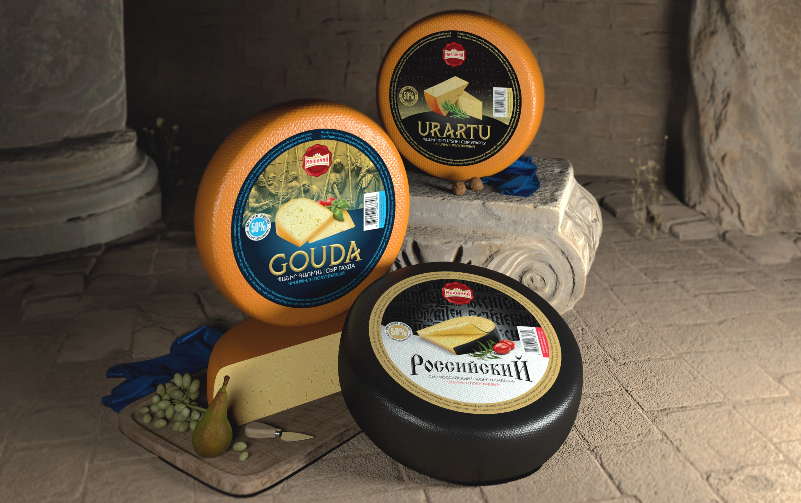
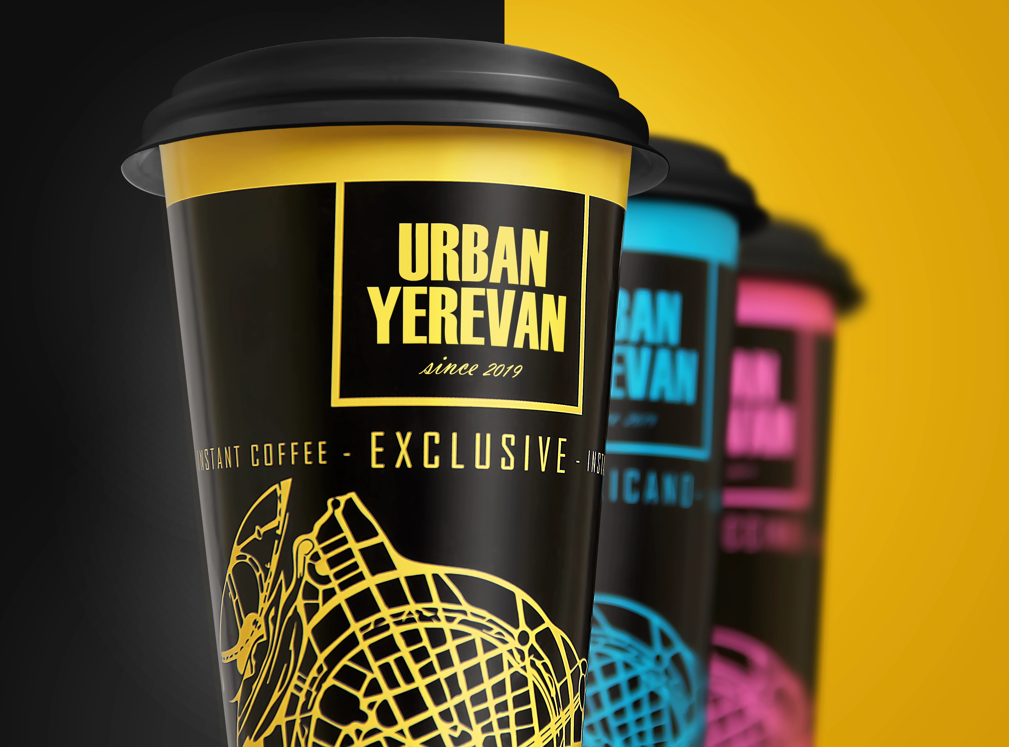
We developed the design of the cookie surface, choosing a drop shape that, in this case, symbolizes a drop of milk. We integrated the logo in the middle so that consumers could more easily identify the manufacturer. Then we created a three-dimensional model of the product to showcase it in maximum detail. Overall, the packaging represents a harmonious blend of classic and modern styles, determined through research into the preferences of the company's target audience. The choice of colors was heavily influenced by the logo: we aimed to create the impression of a unified whole, symbolizing the same values as the company's logo.
